
Apple’s iOS, iPadOS and macOS 27 design kits add more states, better resizing, code-aligned naming and updated Liquid Glass components. The useful part is not the ability to copy a current-looking control. It is seeing how Apple expects navigation, content and system behaviour to remain coherent across states and screen sizes.
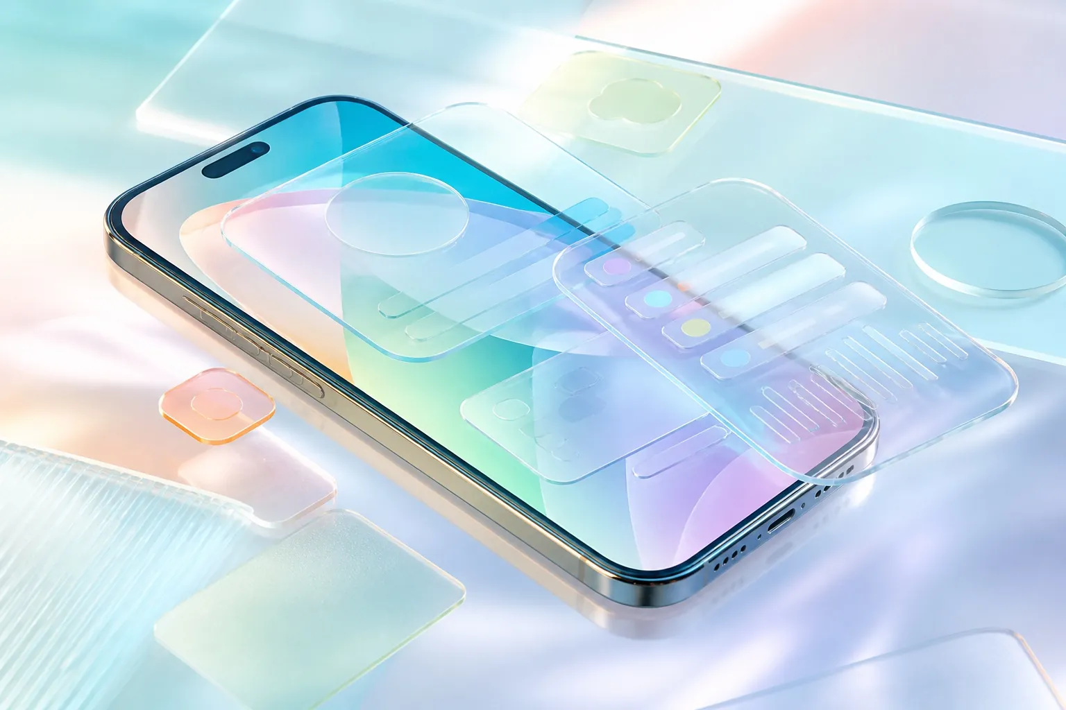
Liquid Glass is easy to imitate at screenshot level: add blur, translucency and highlights, and a mockup immediately feels contemporary. Apple’s own guidance is much stricter. The material belongs primarily to the functional layer of controls and navigation; it is not a default finish for every card, panel and content block.
Start with structure, not glass
Apple frames the current system around hierarchy, harmony and consistency. The interface should keep important content in focus, align with the shapes and behaviour of the platform, and adapt predictably across window sizes and devices. Liquid Glass supports that structure; it does not create it.
That means a product team should settle navigation, content priority and responsive organisation before polishing materials. A translucent tab bar cannot rescue a confusing information architecture. In fact, visual complexity can make a weak structure harder to understand.
Use the material as a functional layer
Apple recommends Liquid Glass for controls and navigation—tab bars, sidebars, toolbars and selected transient controls. Standard materials remain appropriate for the content layer. The separation preserves a sense of place: content can move beneath a stable functional layer without becoming visually indistinct.
The regular variant adjusts luminosity and blur to preserve legibility. The clear variant prioritises the underlying media and should be reserved for sufficiently rich backgrounds, sometimes with a dimming layer. This is a usability decision, not merely an aesthetic choice.
The most convincing platform design is rarely the one with the most effects. It is the one where material, hierarchy and interaction explain each other.
Colour needs restraint
Liquid Glass inherits colour from what sits behind it. Apple advises applying additional colour sparingly and reserving emphasis for an important action or state. A row of tinted controls competes with content and can make contrast unpredictable as backgrounds change.
For branded products, this does not mean removing identity. Brand can remain in content, imagery, typography and key actions. The system layer should continue to behave like the platform so people recognise controls and understand navigation without relearning it.
The updated kits improve design-to-code alignment
Expanded states and code-aligned naming reduce ambiguity. A component is only useful when teams understand its variants, behaviour and platform mapping. Improved resizing is equally important for iPad and Mac contexts where a single fixed artboard cannot represent the real product.
- Use the official kits as a behavioural reference, not a skin to paste over an app.
- Map Figma components to system controls before creating custom alternatives.
- Design light, dark, increased-contrast and reduced-transparency conditions.
- Test content scrolling beneath navigation at realistic extremes.
- Check touch, pointer, keyboard and window-resizing behaviour where relevant.
Adoption does not require a full redesign
Apple explicitly notes that adopting Liquid Glass does not mean rebuilding an existing app from the ground up. Standard components pick up platform appearance and behaviour automatically, while custom effects can be added selectively. This is a sensible migration principle: fix structural problems deliberately and allow the system to handle the rest where possible.
The iOS 27 resources make the direction clearer. Product teams should spend less time recreating highlights and more time validating hierarchy, states, contrast and adaptation. Liquid Glass looks best when it feels inevitable—when the interface would still make sense without the effect, and the material simply makes its structure easier to perceive. View my mobile product design work